What Do You Want Visitors to Do? Choosing the Right Call to Action for Your Website
When someone visits your website, it should be clear what they can do next. But plenty of small business websites make visitors guess. There’s no obvious next step, or the only button says “Contact us” when the customer really wants to check a price, book an appointment or speak to someone now.
That uncertainty costs you enquiries.
A call to action is simply an invitation to take the next step. The right one depends on what you sell, what the customer needs to know and how your business handles new enquiries. Here’s how to choose one that works for you.
Start with the next step your customer needs.
Before adding a button, ask yourself: What’s the most useful action a ready-to-buy customer could take right now?
For a hair salon, that might be booking a cut. For a cleaning company, it could be requesting a quote. For a solicitor, it might be arranging an initial conversation.
The answer shouldn’t be what’s easiest to put on the page. It should make it easier for the customer to move forward.
A good call to action:
- Says what will happen when someone clicks.
- Fits the service and the customer’s situation.
- Leads to a working phone number, form, booking page or download.
- Sets clear expectations about what happens next.
“Get a quote” is more useful than “Submit”. “Book your consultation” is clearer than “Click here”. Make the next step obvious, and make sure the button delivers what it promises.
“Call now” or “Call for an estimate”
A phone call is often the best next step when the customer needs a quick answer, has an urgent problem or needs to explain something that’s hard to capture in a form.
It can suit businesses such as:
- Emergency plumbers or locksmiths.
- Restaurants taking bookings or answering questions.
- IT support companies diagnosing an issue.
- Consultants who qualify enquiries through a conversation.
Be specific about why someone should call. “Call now” works for an urgent service. “Call for an estimate” tells a potential customer what they’ll get from the conversation.
If you use a call button, make sure it opens the right number on mobile. Show your opening hours, too. A customer who calls after closing should know when they can try again or have another way to get in touch.
Use a call button when you can answer promptly and a conversation is a practical first step.
“Request a quote” or “Get an estimate”
Choose a quote request when the price depends on the details of the job. A painter may need to know the property size. A cleaner may need to ask how often the customer wants a visit. A company making bespoke furniture needs to understand what the customer has in mind.
A short form can gather the details you need without making the customer work too hard. Start with the essentials:
- Name and preferred contact details.
- The service they’re interested in.
- A short description of the work.
- Location, if it affects whether you can take the job.
Only ask for photos or extra information if they’ll help you respond. And tell visitors what happens after they send the form. For example: “We’ll review your details and get back to you within one working day.”
Don’t call it a booking if submitting the form only starts a discussion. A quote request is not the same as a confirmed appointment. Clear expectations make the first interaction feel more straightforward and trustworthy.
“Book online”
Online booking works well when your service has set appointment times, and customers can choose from available slots. It’s a natural fit for salons, classes, consultations and other appointment-based businesses.
Before adding a booking button, check that customers can see the details they need to make a decision:
- What the appointment includes.
- How long it takes.
- The price, or how the price is worked out.
- Available dates and times.
- What happens after they book.
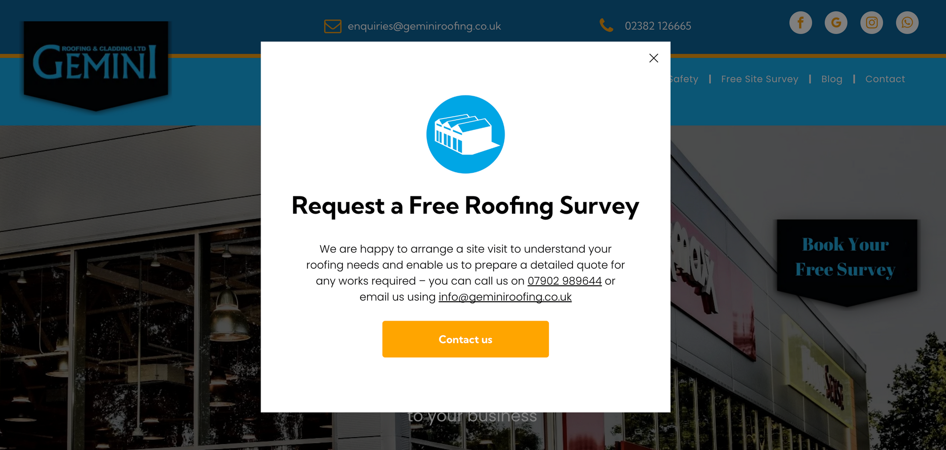
A button labelled “Book now” should take someone to a real booking process. If it opens a form and you’ll call later to confirm availability, use a more accurate label such as “Request an appointment”.
Make the button match the process. Customers shouldn’t have to guess whether they’ve booked or just sent an enquiry.
“Send a message” or “Ask a question”
Not everyone is ready to call or book. Some visitors have a specific question, want to check whether you cover their area, or prefer to write rather than speak.
A message option can help them take that smaller step. Use a clear label such as “Ask about our cleaning service” rather than a generic “Get in touch”. Keep the form short and tell people when you’ll reply.
This can work particularly well as a secondary option. For example, a consultant might make “Book an initial call” the main action, while offering “Ask a question” for people who aren’t ready to schedule.
A message form needs someone behind it. Check it regularly, confirm that the message has arrived and respond within the timeframe you’ve promised. A contact option only helps if you follow up.
“Download our price guide”
A price guide can be useful when customers want to understand typical costs before speaking to you. It might suit a training provider with several course options, a consultant with different service packages or a business where customers often ask the same pricing questions.
Make the guide useful. Explain what’s included, what could change the price and what the customer can do next. A document that lists a few vague price ranges without context won’t help people make a decision.
You can offer a quote or conversation after the download, but don’t make the guide a hurdle for customers who are ready to contact you directly. Keep your main phone, booking or quote option easy to find.
Use a price guide to answer a real customer question, not just to collect contact details.
“Buy now”, “Order online” or “Sign up”
If customers can purchase a product, gift voucher or package directly from your website, let them do it. “Buy now” or “Order online” is a better fit than sending someone through a general enquiry form.
A sign-up button can work for a newsletter, event or class, as long as it says what someone is signing up for. “Join our monthly baking class” is clearer than “Sign up”.
Be especially clear about any payment, commitment or recurring charge. Visitors should know what they’re agreeing to before they click. A direct action works best when the offer and the terms are clear.
How to choose the right action for your business
Try these three questions:
- What does a customer usually need before they can commit? If they need a conversation, invite them to call or send a message. If they need to compare options, a price guide may help.
- Can the customer make a decision online? If appointments, prices and availability are clear, online booking may be right. If each job is different, start with a quote request.
- Can your business reliably deliver what the button promises? Don’t offer instant booking if you can’t keep availability up to date. Don’t promise a same-day response if you won’t be able to provide one.
Then choose one main action for each page. Your homepage might invite people to request a quote. A service page for a fixed-price appointment might offer online booking. A page about urgent call-outs might put the phone number first.
You can still provide other ways to get in touch. Just make one option stand out, and give the alternatives less visual emphasis. When every button looks equally important, it’s harder for visitors to know where to start.
Check your buttons this week.
Look at your website on a phone. Can you tell what to do next without scrolling through several paragraphs? Tap every button and check that it leads to the right place. Submit your own form and confirm the message reaches your inbox.
Then review the wording:
- Replace “Submit” with a label that describes the result.
- Replace vague “Contact us” buttons with a specific action where you can.
- Check that appointment buttons lead to actual booking, not an unexpected enquiry form.
- Add a realistic response time beside quote or message forms.
- Make sure your main action is easy to find on each important page.
You can also keep track of which enquiries turn into real conversations, bookings or jobs. A button that gets plenty of clicks isn’t useful if it attracts the wrong enquiries or leads nowhere.
The best call to action helps the right customer take a clear, manageable next step.
If you’re unsure whether your website makes that step obvious, Overt Digital Media offers a free website audit. It’s a simple way to spot areas where your site could make it easier for visitors to get in touch.
Contact Us